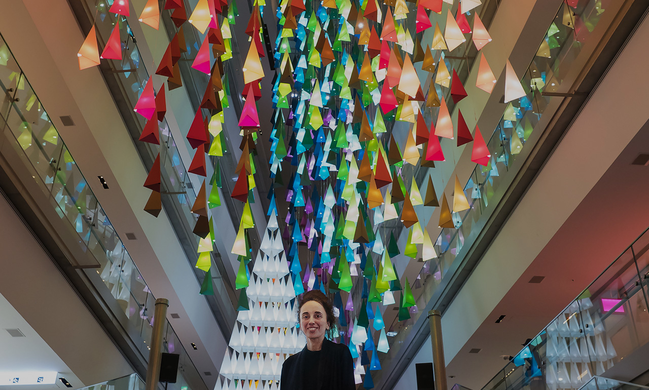
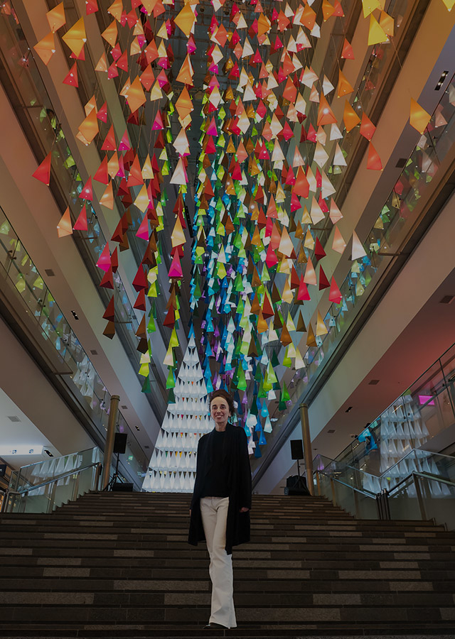
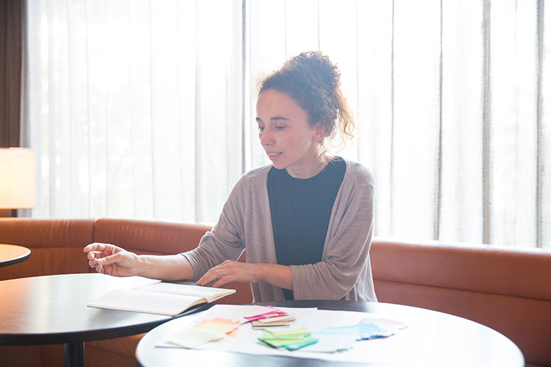
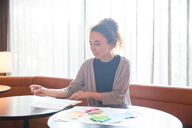
“Christmas Forest in 100 Colors,” a Christmas illumination installation designed by French architect and designer Emmanuelle Moureaux, will be on display from Wednesday, November 8 to Monday, December 25 at the large atrium stairway in Omotesando Hills.
True to its name, the installation features 100 colors and layers of gradated illumination, and was produced based on Moureaux’s own concept of “shikiri.” Moureaux says that while she was living in France, she actually had no awareness of color. We talked with Moureaux about this unlikely episode in her career, as to how the concept of “shikiri,” which is now her byword, came into being.

---- When you were studying architecture in France, did you have some sort of concept in regard to color?
Emmanuelle: To tell you the truth, when I was in France, I had absolutely no awareness of color. As I had an interest in Japanese literature and culture, I selected the city of Tokyo as the theme for my graduation thesis, which offered the opportunity to come to Japan. This was a big turning point for me. This was the era where there was no Internet. While I was riding the train during my first visit to Japan in 1995 from Narita International Airport to Ikebukuro, I saw this lovely color of blue which you’d never find in the natural world, which had such an impact on me. Looking closer, it was the color of the roof of a house; but I remember it as clearly as today. Afterwards, I went to Ikebukuro where my ryokan was, and when I looked at the city, it was filled with a countless number of colors, which gave me the feeling of floating in air. Hundreds, even thousands of colors floating in three-dimensional layers—it was really an emotional experience for me. Just ten minutes after I arrived at the ryokan, I made the decision to live in Tokyo.
---- Are there not many colors used in the architecture and cityscapes of France?
Emmanuelle: No, there aren’t. French urban architecture is based more on perspective. You are stuck between the grayish buildings, but when you look up, you see the blue sky. This causes you to look only in one direction, so the cityscape is not three-dimensional as it is in Japan. In Tokyo, there are buildings and billboards of many different heights and volumes that are layered together to create a sense of depth. These three-dimensional layers of color really had a profound impact on me.
---- Japanese gardens are also designed to look as if they are layered, when you look at them from different angles. How did your own concept of “shikiri” come about, which uses the traditional Japanese shikiri methods of dividing space?
Emmanuelle: After my visit to Japan, I returned to France, acquired my certification as an architect and began living in Tokyo in earnest. What I found when I actually began living here and walking around the city was that Japanese modern architectural design and interior design does not really make much use of color. As I said before, I was originally interested in Japanese literature and culture, but I really had no visual concept of Japan aside from what I saw in books. So, as with traditional architecture, I imagined that the colors used in kimonos or the unique tones of color used in Japan would be employed in modern architecture as well. However, I was quite surprised to find after actually living here that colors were not used in Japanese architecture at all. In architecture, they only use colors as a finishing touch after the building is completed. Then I was dismayed to notice how so many traditional houses are being torn down. In traditional Japanese houses, you can find dividers, shoji and fusuma. These dividers go along well with Japan’s particular climate, and can be freely used to create vague boundaries that are not exactly walls, where you can still feel the presence of people and of nature. I think that this is a fantastic aspect of culture that is unique to Japan. In this way, through actually living here, my awareness of “color” and “shikiri” has deepened. Thus, I came up with my concept of “shikiri” by being inspired by the colors and layers I felt in Tokyo, and the works I have released that use color to separate spaces and my work of creating with color are based on this concept. I do feel that this concept is connected with the layered colors I experienced in Tokyo and the layer structure that is like traditional Japanese architecture. When many people see my three-dimensional space and its use of colors, I would like for them to feel as emotional as I did, when I had my experience seeing the cityscape of Tokyo. The core of my shikiri concept is to create experiences that make you smile after you see the colors, moving your heart to feel something.
---- Tell us about the first work that you created after you came up with the shikiri concept.
Emmanuelle: When I began living in Japan, I was working as a French teacher; but in every other spare moment, I would be out walking around the city of Tokyo. I chose one station every day, and walked around that area to learn more. I didn’t have a particular building or tourist spot in mind to see—I just wanted to keep looking at the city itself. From this experience, I had the revelations that I mentioned before; and my first work using the concept of shikiri was made on commission from one of my French students. Her mother owns a beauty salon in Harajuku. I was involved in spatial design for her company. That was my first experience in spatial design with color. The people who saw this space when it was completed were quite moved, with some telling me that “it feels like the colors have cleansed my spirit.” I felt how strong the power of color was at that time.

---- How did the “100 colors” that you are using for the illumination this time come about?
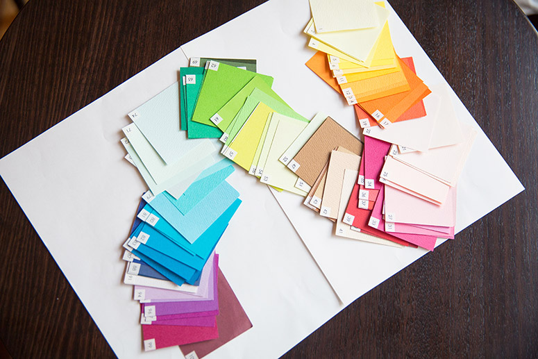
Emmanuelle: In 2003, a while after I began my life here in Tokyo, I opened an office here; and in 2008, I began teaching seminars at the Tohoku University of Art and Design in Yamagata. Since 2008, I had been giving seminar students the assignment of creating their own 100 colors. Although the human eye can perceive hundreds of colors, color is not used much in our day-to-day lives. For that reason, when someone asks, “What’s your favorite color?”, you would only be able to think of several hundred. In this way, we are not intimately familiar with a multitude of colors, so I thought that in order to get people to experience the richness of color, I would use familiar numbers like 100 colors, 100% and so on. I have my students choose 100 things they like, such as chairs, chocolates and so on, and 100 colors, in order for them to enjoy the richness of color.
---- What was the first work that you produced using “100 colors”?
Emmanuelle: That was an installation in a commercial building located in Shinjuku. In 2013, for the 10th anniversary of our office, I created a space that simply layered 100 colors, to fully express the concept of shikiri. Normally, we cannot see 100 colors at the same time, so in order to allow people to see all of the colors at once, we created a space where we hung an endless number of papers in 100 colors at a height just below a person’s height, and allowed visitors to experience the colors at full length while sitting on a cushion. This was my first installation in which I used “100 colors.” I felt so good when I saw the finished product, and I didn't want that feeling of deep emotion to end... so I have been continuing with my “100 colors” installations ever since.
---- Modern Japanese architecture is often bereft of color. This is precisely why the power of Emmanuelle Moureaux’s work resounds in the hearts of people.
Emmanuelle: I’m sad to see the traditional Japanese houses go. That said, one of the things I like about Tokyo is how the city changes in appearance with the times. In Paris, there are still buildings standing from the 19th century. Even though people and times have changed, the city still looks the same. I feel a real sense of disconnect with this. On the other hand, in Japan, they simply build new buildings when the times call for it, and tear them down when they are no longer needed. It’s quite unique and interesting for me to see how the way people think, their technology and the look of their cities changes at the same time.
---- We understand that this was your first installation to feature Christmas illumination, but are there any other projects you want to take on in the future?
Emmanuelle: Although my credentials are as an architect, I’ve tried to approach a lot of diverse and different projects, involving spatial design, installations and designing trains in Taiwan. That’s why every day for me is like a new challenge, in a good way. Each time, I take on themes for projects that are difficult and that I haven’t done before. It’s because I haven’t done these things before that I want to give them a try. In Japanese residences, the use of prominent colors is still not in the mainstream. Over the past several years, I hope that many people have slowly begun to feel the beauty and power of colors through my work, both in and out of Japan. My eternal challenge is to deliver that emotional feeling to many people, the very same as when I first saw the city of Tokyo. The thing I most want is for many people inside and outside of Japan to come to my “100 colors” spaces and feel the colors with their entire being. After all, when do you ever get the chance in your daily life to see 100 colors in one space? This should be a lovely once-in-a-lifetime experience for everyone who visits. I hope that this Christmas illumination will put a smile on the faces of many people who come to visit.
Profile
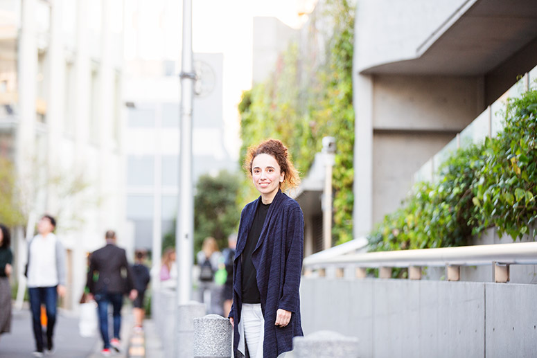
Emmanuelle Moureaux
(architect/designer)
フランス生まれ。1996年より東京在住。 emmanuelle moureaux architecture + design主宰。東京の"色"と街並が成す複雑な"レイヤー"と、日本の伝統的な"仕切り"から着想を得て、色で空間を仕切る「色切/shikiri」コンセプトを編み出す。色を通して1人でも多くの人にエモーションを感じてもらいたいという想いを胸に、建築、空間、デザイン、アートなど多様な作品を創造し続けている。東北芸術工科大学准教授。受賞歴として、「International Architecture Awards」、「ARCHITIZER A+AWARDS」、「ICONIC AWARDS」、「Aesthetica Art Prize」等、国内外の様々な賞を受賞。URL:http://www.emmanuelle.jp/
Photo by Yutaro Tagawa
Text by Yoshiko Kurata
For more information about Christmas illumination, click here
The Twinkling “Christmas Forest in 100 Colors”— An Interview with Emmanuelle Moureaux Vol.1
FEATURE
VIEW ALL-
 2023.11.09
「LÝFT GÝM」エドワード加藤「"表参道ヒルズのジム"ならではの付加価値」
-
 2023.10.31
"CLANE" 8th anniversary. Ena Matsumoto talks about “things that change, things that don’t change”
EVENT&TOPIC
VIEW ALL-
 2024.04.25
ユナイテッドアローズ ゴルフ 5.3 NEW OPEN
コンセプトは "GOOD MANNER, GOOD SENSE, GOOD PERFORMANCE"。ベーシックでありながら、ほどよくトレンドを取り入れたデザイン性と、スポーツウエアとしてのパフォーマンスを追求した機能性の高いゴルフウェアを取りそろえています。 本館B1F「ヒルズ ボックス」にて2024年5月3日(金・祝)~6月9日(日)までの期間限定ショップとなります。
-
 2024.04.17
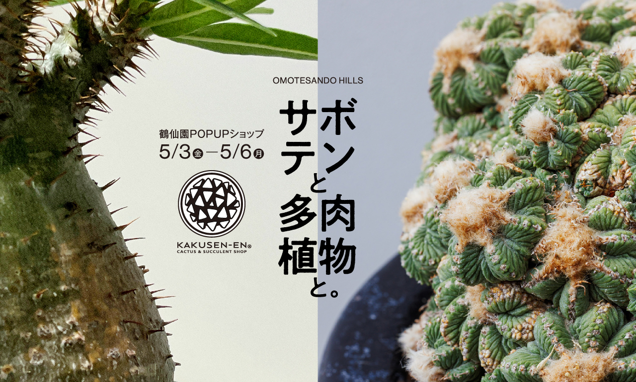
サボテンと多⾁植物と。
― 浪漫溢れる不思議と神秘に迫る世界へようこそ ― 表参道ヒルズがゴールデンウィークにアレオーレとビザールな世界でマニアを唸らせる、サボテンと多肉植物の専門ショップ「KAKUSEN-EN(鶴仙園)」とコラボレーション!POPUPショップと吹抜け大階段の空間装飾を行います。 葉や茎に⽔分をたっぷり含んだ姿が可愛らしい多⾁植物。その種類は豊富で、サボテンをはじめ、根や幹の部分が⼤きく膨れ上がったコーデックス(塊根植物)など突き詰めると果てがない奥深さがあります。近年魅了され続けてやまないマニアックな愛好家だけでなく、植物から癒される、⼈と⾃然の新しい関係性との出会いを是非この機会にご堪能ください。 ※KAKUSEN-EN(鶴仙園)POP UP ショップは 5月3日(金・祝)~5月6日(⽉・祝)開催。吹抜け大階段の空間装飾は5月12日(⽇)まで実施します。 <KAKUSEN-EN(鶴仙園)> 今や日本でサボテンを育てているならば、知らない人はいないであろう多肉植物専門店。北⽶、中⽶、南⽶そしてアフリカ⼤陸原産のサボテンはじめとした多⾁植物を取り扱い、一般層からコア層まで、幅広く満足させるサボテン・多肉植物の専門店として、一線を画す存在となっている。
-
 2024.04.09
KIDS & FAMILY Mail News
The new "HILLS APP/HILLS CARD KIDS & FAMILY Mail News" will start on Wednesday, April 24th. Please register if you are interested.